Street: Week 55…
by Rodney Campbell on Jan.30, 2012, under Life, Photography, Street
Week 55
Some from North Sydney this week…
Note: These images (especially the wider shots) look much better when larger – so click any of the images below to see larger versions in an inline overlay slideshow gallery viewer.
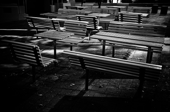
I liked these tables and benches and the way the early morning light was hitting them…
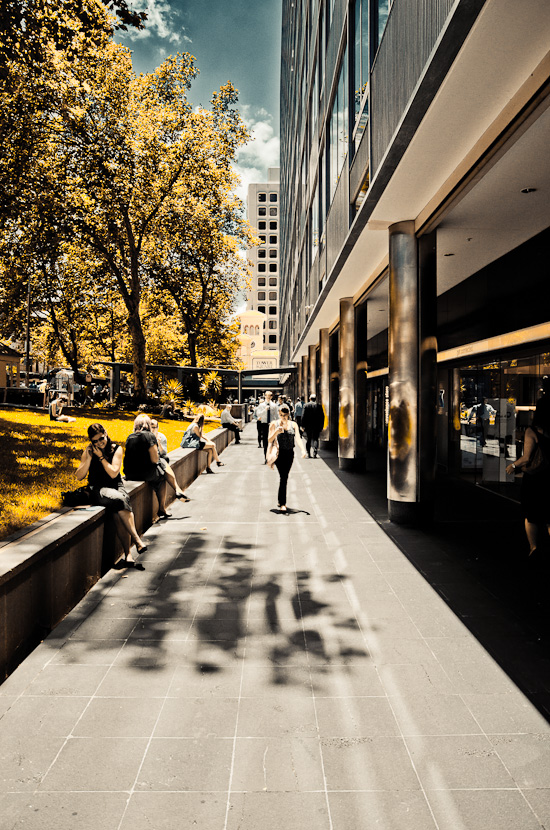
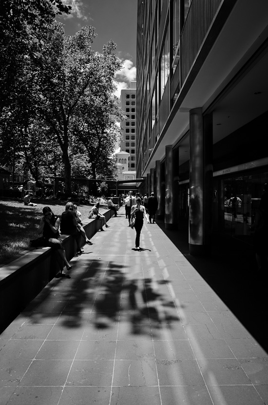
When I first took this shot I was thinking black and white and I liked the way the “infinitely” tall building on the right juxtaposed the green open space on the left with the row of tall trees and the smooth path down the middle – I just waited for an appropriate subject to be in the right position in my frame and snap…
However during post processing I created this colour versions of the image (note – these aren’t the original colours) which I really liked (possibly more than the mono version) – but I’d like to let you the viewer decide – which do you like the best?…
and here’s a monochrome conversion I’ve done


February 1st, 2012 on 1:35 am
Nice work, as always! Both the B&W and Color version of the city scape are striking. While the B&W version concentrates on the architecture, I really like how the colored version brings the people into the scene – and the color work feels like it came directly from the pages of Fast Company. Nicely done!
February 1st, 2012 on 8:31 am
I like the colored one just because the b&w one is too dark, too black: the sky and the building in the background are properly exposed but it’ only a small part of the photo, the rest is just … black.
The colored one is good and I really enjoy watching it. Is that a preset? I mean, something like Velvia or else?
February 1st, 2012 on 9:32 am
Thanks Adriel – I think you’re right – the colour version does highlight the people more and I think thats what made me prefer it
February 1st, 2012 on 9:33 am
Thanks – it started from a preset yes – one called Hallowed Black I believe.