Archive for March, 2012
It’s all in the Eyes…
by Rodney Campbell on Mar.09, 2012, under Life, Photography
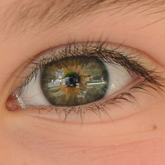
I�was at school the other day and snapshotted this grab of my youngest daughter sitting in the playground. Yes it’s my favourite lens for portraits (the 50/1.4) but I got lucky on the focus this time with it’s razor thin DoF (even at f/2) with both irises and not much else in focus 🙂
Note: These images (especially the wider shots) look much better when larger – so click any of the images below to see larger versions in an inline overlay slideshow gallery viewer.
and a 100% crop of the eye (self portrait :)) – even the lashes are oof and by the eyebrows it’s blur time…
Street: Week 60…
by Rodney Campbell on Mar.06, 2012, under Life, Photography, Street
Week 60
A varied selection this week…
Note: These images (especially the wider shots) look much better when larger – so click any of the images below to see larger versions in an inline overlay slideshow gallery viewer.
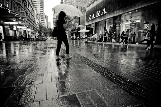
Sydney Rain
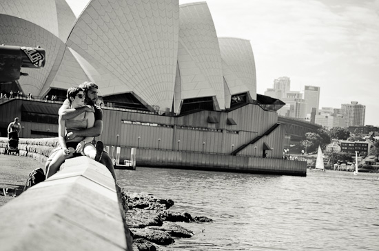
A Romantic Opera
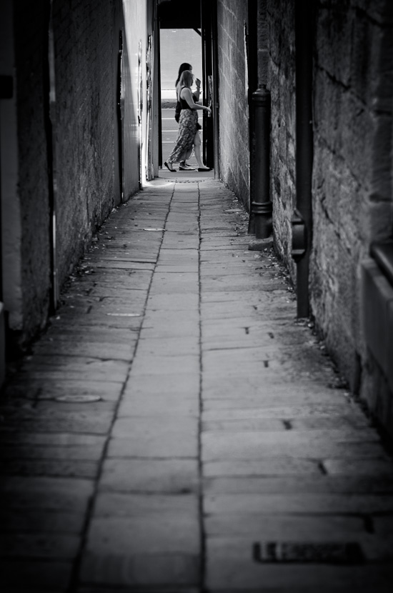
Walk
Sydney University Architectural…
by Rodney Campbell on Mar.01, 2012, under Life, Photography
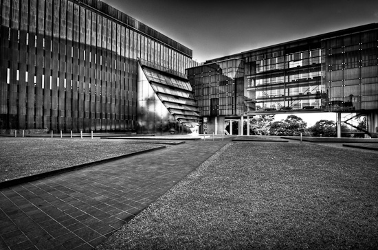
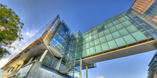
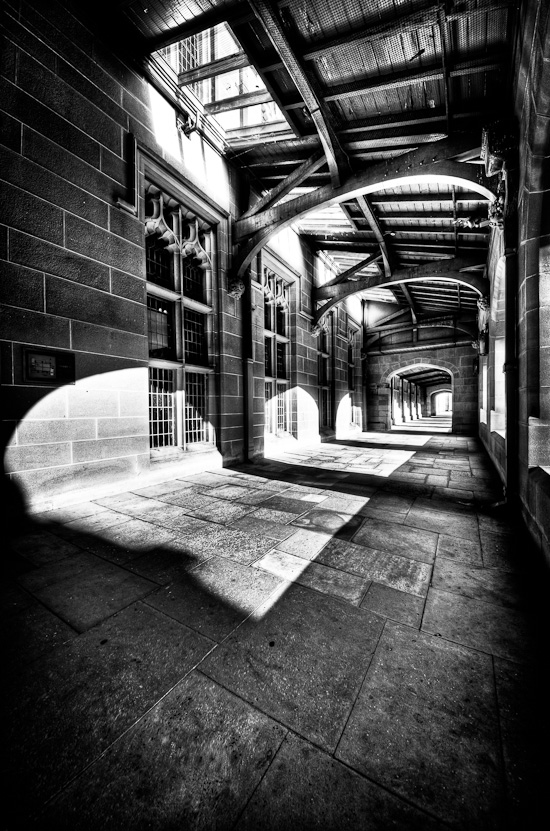
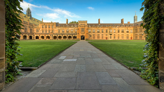
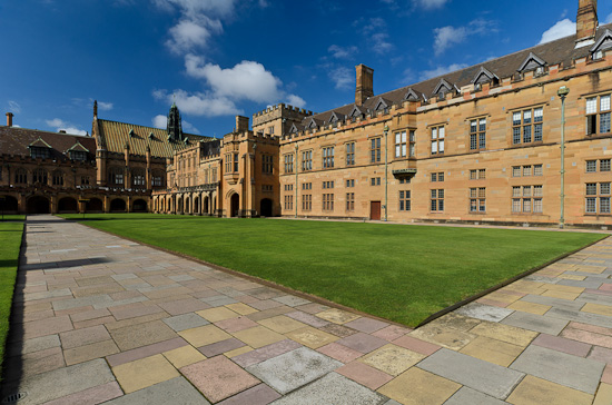
Over the weekend some photography friends and I had planned a image editing/workflow workshop. The idea was to shoot at a location and then spend time afterwords post processing our images together to learn from each other. The grounds of Sydney University was the chosen venue and we arrived at 7AM for our just post sunrise shoot – we spent a couple of hours taking some images – most of them architectural of some of the very new (Old Geology – now Law) and some of the very old buildings (Main Quad) on campus.
As it turns out the later didn’t really happen – although we did spend quite a bit of time chatting about our various workflow and processing techniques (in Adobe Photoshop Lightroom).
Here are some of my images from the morning…
Note: These images (especially the wider shots) look much better when larger – so click any of the images below to see larger versions in an inline overlay slideshow gallery viewer.
My take on a stark monochrome rendition of one of the modern structures
and from the other side and below with an extremely wide view – I’m not entirely happy with this image – it’s got the very distorted hard angular view I was going for and the diagonal from bottom left to top right – but it isn’t gelling for me and I don’t know why…
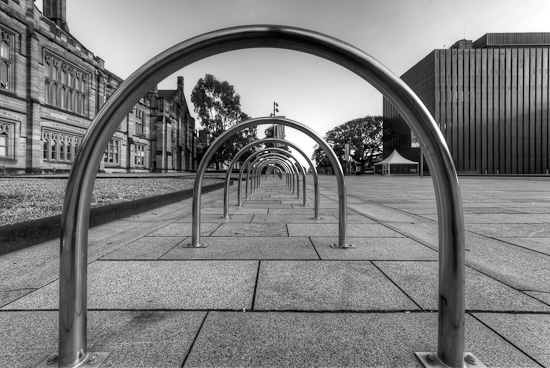
gotta like chrome rings nicely in a row
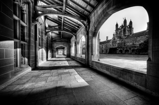
Two views of the corridors of Hogwarts 🙂
and two colour views of the interior of the main quad – HDR question of the day: neither, either, both?

