Archive for September, 2017
Whitewash – Elevate – A World Above…
by Rodney Campbell on Sep.19, 2017, under Life, Photography
The fifth image in my Elevate portfolio – a series of top down aerial images with a twist – seeing the normally unseen in our typical urban environment.
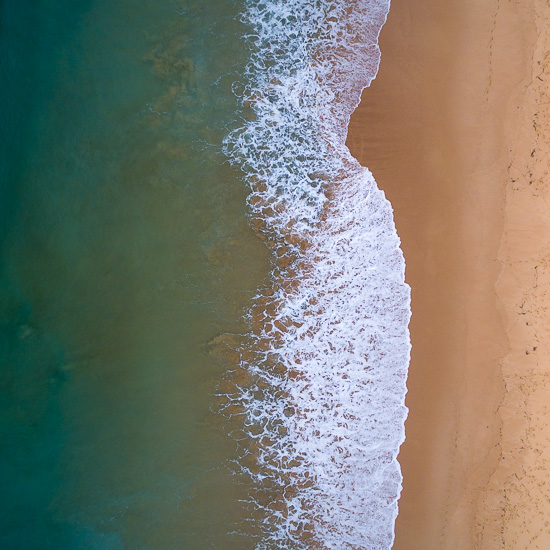
Whitewash
This one typical of Sydney’s many coastal beaches – here a view above Manly beach.
Note: These photographs (especially the wider shots) look much better when larger. To see larger versions in an inline overlay slideshow gallery viewer click any of the images.
Scraped from the Bottom – Elevate – A World Above…
by Rodney Campbell on Sep.17, 2017, under Life, Photography
The fourth image in my Elevate portfolio – a series of top down aerial images with a twist – seeing the normally unseen in our typical urban environment.
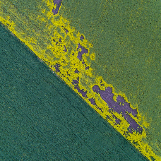
Scraped from the Bottom
Note: These photographs (especially the wider shots) look much better when larger. To see larger versions in an inline overlay slideshow gallery viewer click any of the images.
Delicate Ranges – Elevate – A World Above…
by Rodney Campbell on Sep.15, 2017, under Life, Photography
The third image in my Elevate portfolio – a series of top down aerial images with a twist – seeing the normally unseen in our typical urban environment.
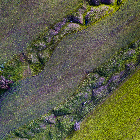
Delicate Ranges
Note: These photographs (especially the wider shots) look much better when larger. To see larger versions in an inline overlay slideshow gallery viewer click any of the images.
Raced – Elevate – A World Above…
by Rodney Campbell on Sep.13, 2017, under Life, Photography
Image number two of my Elevate portfolio – a series of top down aerial images with a twist – seeing the normally unseen in our typical urban environment.
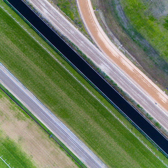
Raced
Note: These photographs (especially the wider shots) look much better when larger. To see larger versions in an inline overlay slideshow gallery viewer click any of the images.
Elevate – A World Above…
by Rodney Campbell on Sep.11, 2017, under Life, Photography
Elevate – some time ago I had an idea for my next portfolio and possibly exhibition.
It was going to be based around a series of top down aerial images with a twist… 🙂
My “concept” as it were is to feature photography which is less about recognisable images, places, landscapes or things and more about interesting patterns, shapes, colours and texture.
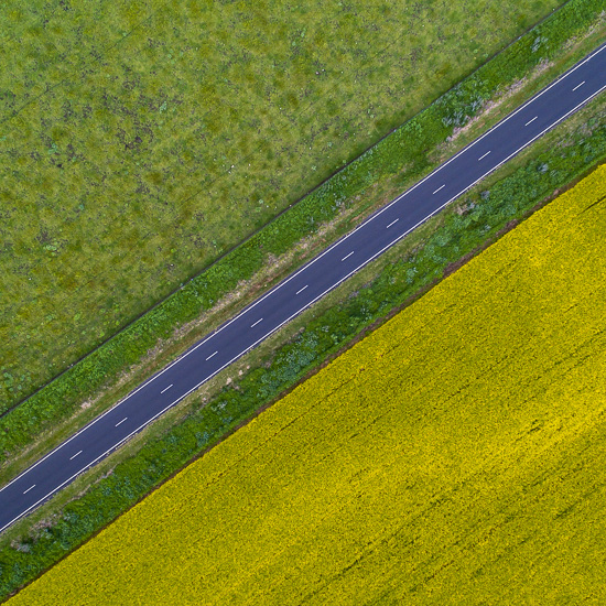
Forward Slash
Note: These photographs (especially the wider shots) look much better when larger. To see larger versions in an inline overlay slideshow gallery viewer click any of the images.
The view from directly above looking straight down is already reasonably unexpected but I wanted to take that further and show even more unexpected and unusual views – many from within the greater Sydney metropolitan area.
The idea is around seeing the normally unseen in our typical urban environment. You live here in a vast and busy metropolis and drive past these places every day without seeing or even knowing they exist like this. Ideally it would be things you can’t instantly or even eventually recognise, which leave you wondering what the heck and where the heck is that!
I settled on a arty square format for all images which I think suits the material and all images are taken from directly above looking straight down. I’ve titled the work “Elevate” (thanks Melinda for the suggestion) as it depicts the “World from Above”.
The majority of the portfolio is arranged in sequences (blocks) of four images which fit together as a mini series within the larger portfolio.
The processed images and a portfolio ensued, and I’m probably going to have myself a book printed from the images. Alas the exhibition never eventuated so what follows will be an image every few days from my portfolio…
