Sagrada Família – Interior…
by Rodney Campbell on Dec.30, 2017, under Life, Photography
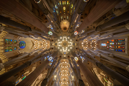
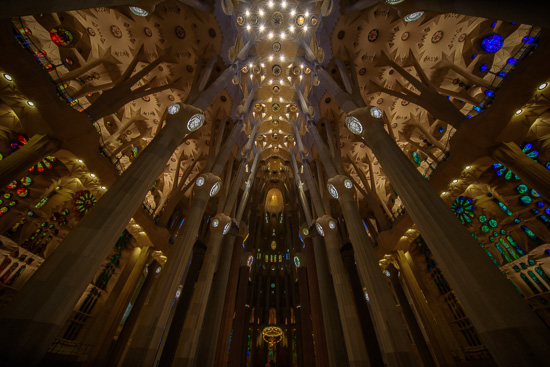
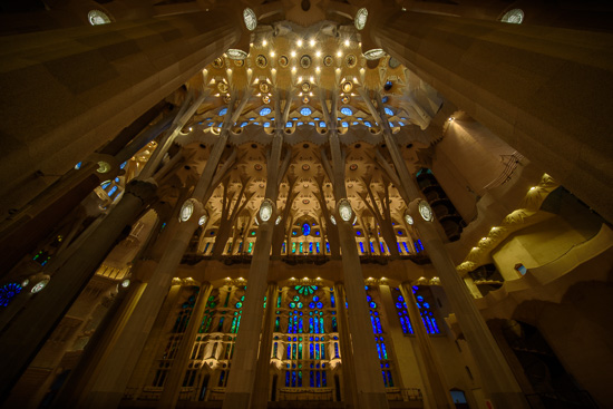
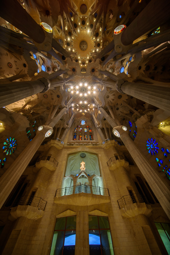
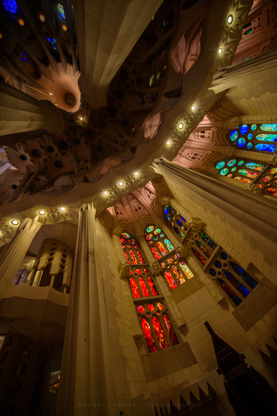
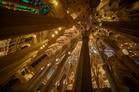
The interior of the Sagrada Família was as expected pretty damn incredible.
Sagrada Familia
The church plan is that of a Latin cross with five aisles. The central nave vaults reach forty-five metres while the side nave vaults reach thirty metres.
Note: These photographs (especially the wider shots) look much better when larger. To see larger versions in an inline overlay slideshow gallery viewer click any of the images.
The columns of the interior are a unique Gaudí design. Besides branching to support their load, their ever-changing surfaces are the result of the intersection of various geometric forms. The simplest example is that of a square base evolving into an octagon as the column rises, then a sixteen-sided form, and eventually to a circle. This effect is the result of a three-dimensional intersection of helicoidal columns (for example a square cross-section column twisting clockwise and a similar one twisting counter-clockwise).
Essentially none of the interior surfaces are flat; the ornamentation is comprehensive and rich, consisting in large part of abstract shapes which combine smooth curves and jagged points. Even detail-level work such as the iron railings for balconies and stairways are full of curvaceous elaboration.
The Forrest
